

Helping policymakers make sense of climate data
Assessing how well the Intergovernmental Panel on Climate Change’s (IPCC) graphics are understood by the policymakers who rely on them—so that critical science can be clearer, more usable, and more actionable.
Share this page
Reports

A detailed summary of the study and its findings can be found in the report below.
The full study and methodology can be found in a special edition of the journal Climatic Change.
Recent Updates
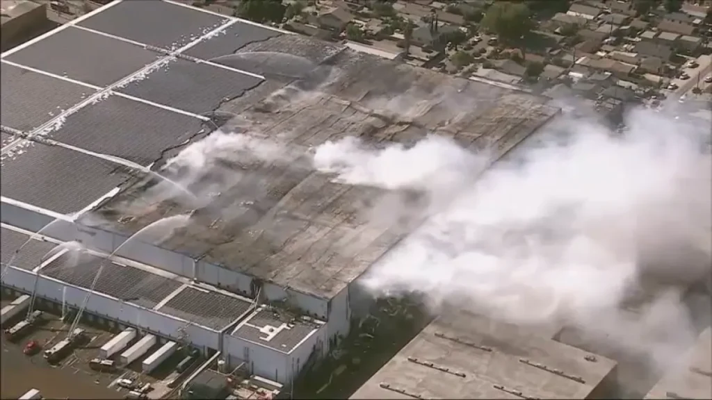
USC is offering free soil testing amid Boyle Heights pollution concerns
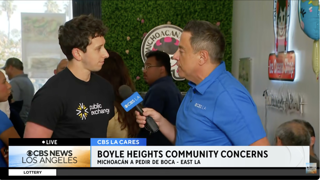
CBS LA Cares hears from East Los Angeles residents at ice cream social event
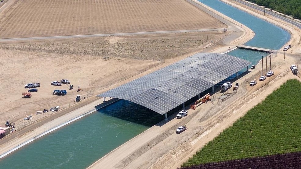
California Needs Water and Clean Power. It Might Have a Fix for Both.
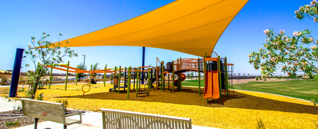
ShadeLA offers a playbook to help city meet shade goals
Related Projects

- USC
Testing L.A.’s oceans and rivers after the 2025 wildfires
Measuring water quality post-wildfires to understand potential health and environmental risks.

- USC
Greening L.A.’s hottest streets
Bringing more trees, shade, and fresh air to L.A. by identifying where, what kind, and how many trees to plant for the biggest impact.
- USC
Tracking climate stories on screen
Tracking how climate stories impact the TV and film industry—and how they shape audience perceptions of climate change.