

Helping policymakers make sense of climate data
Assessing how well the Intergovernmental Panel on Climate Change’s (IPCC) graphics are understood by the policymakers who rely on them—so that critical science can be clearer, more usable, and more actionable.
USC Completed 2021
Share this page

Impact
Better graphics don’t just make reports look cleaner—they help people make better choices in the real world. By working with the IPCC to test and improve its visuals, we made complex climate science easier for everyone to understand—from heads of state to city planners to journalists. Clearer graphics mean policies built from IPCC science are helping protect communities, guiding investments that speed up clean energy, and informing local actions that keep people safer.
Challenge
Around the world, policymakers rely on the IPCC for trusted insights into climate science. Yet as the science has grown more complex, so have the graphics used to explain it. When visuals are confusing, even well-intentioned leaders risk misunderstanding the science—or miscommunicating it to others. To keep climate science clear and trusted, the IPCC needed to simplify its graphics and ensure they could be understood quickly and accurately by the people making high-stakes decisions.
Our Plan
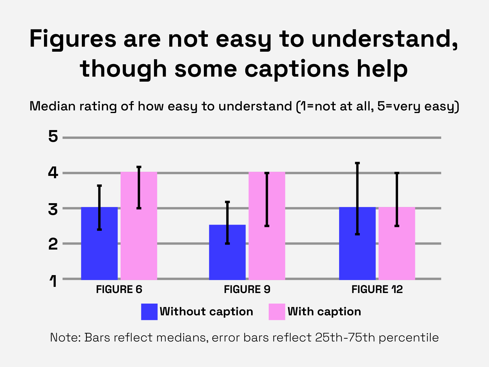
With input from climate policy experts around the world, we texted how IPCC graphics were understood and where they fell short. From there, we created a simple checklist and a set of clear guidelines to help authors design visuals that policymakers can understand, trust, and act on.
Project Goals
Understand how graphics convey findings
We interviewed climate policymakers to find out which visuals help or hinder them in making decisions.
Evaluate design and messaging impact
Based on participant feedback, we built practical guidelines to help the IPCC simplify complex science into clear, actionable visuals.
Approach
We interviewed 20 experts from 12 countries who shared how they interpret—and sometimes misinterpret—IPCC visuals. We then used their feedback to make recommendations on how to restructure visuals to make them easier to understand.

Qualitative Interviews

Data Analysis

Design Checklist

Graphics Formatting
Presentation
Watch Dr. Wandi Bruine de Briun share our work about clearly communicating climate graphics with the Intergovernmental Panel on Climate Change (IPCC).
Recent Updates
ShadeLA design contest winners envision a cooler Los Angeles (literally)
USC Architecture unveils jury and awards for ShadeLA and Shade Zones Competition
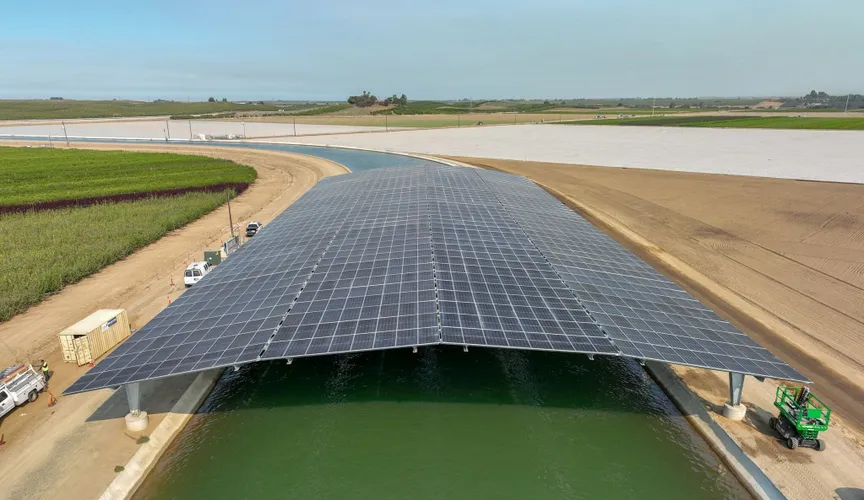
California’s first solar-covered canal comes online
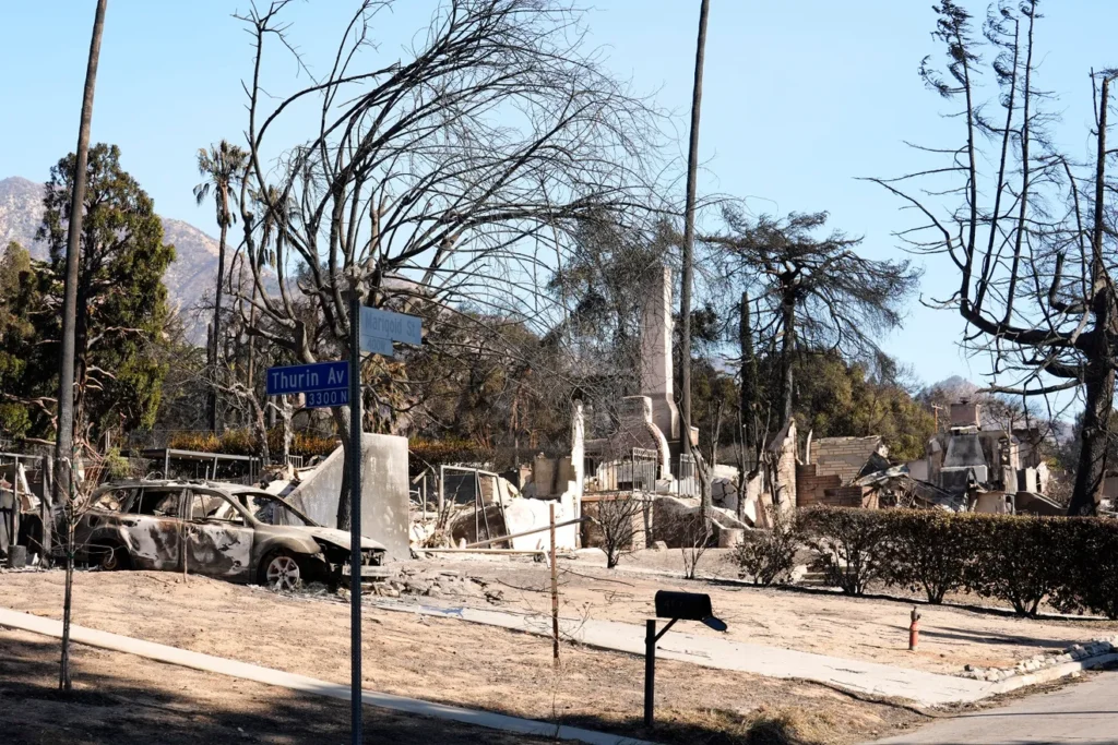
Homeowners trying to rebuild after Altadena’s Eaton Fire face concerns over lead levels in soil
Related Projects
IJLA Infrastructure Scorecard: Landscape View

- USC
Testing L.A.’s oceans and rivers after the 2025 wildfires
Measuring water quality post-wildfires to understand potential health and environmental risks.
- USC
Greening L.A.’s hottest streets
Bringing more trees, shade, and fresh air to L.A. by identifying where, what kind, and how many trees to plant for the biggest impact.