

Helping policymakers make sense of climate data
Assessing how well the Intergovernmental Panel on Climate Change’s (IPCC) graphics are understood by the policymakers who rely on them—so that critical science can be clearer, more usable, and more actionable.
USC Completed 2021
Share this page
Partners
We developed practical guidelines to make clearer climate visuals, so climate policy makers can act on what they see.
The IPCC delivers the world’s most trusted climate science, but when its graphics are too complex, policymakers can’t easily understand the risks or act on them. We partnered with the UN Foundation to find out which visuals weren’t working, so we could make them clearer and more effective.
Easier-to-understand climate science means faster, more confident decisions—leading to stronger climate solutions, from global agreements to local plans.
Meet the project team

Marianna Babboni
Project Manager
Research team

Wändi Bruine de Bruin
Project Lead
USC Price School of Public Policy, and Dornsife Psychology

Lila Rabinovich
USC Dornsife Center for Economic and Social Research

Lance Ignon
Price School of Public Policy, Communications

Sigourney Luz
Intergovernmental Panel on Climate Change

Alix Kashdan
United Nations Foundation
Recent Updates
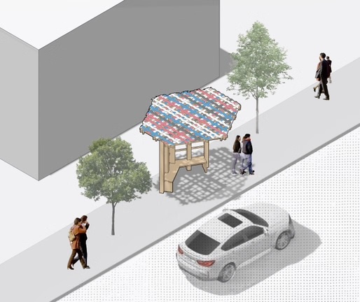
ShadeLA design contest winners envision a cooler Los Angeles (literally)

USC Architecture unveils jury and awards for ShadeLA and Shade Zones Competition
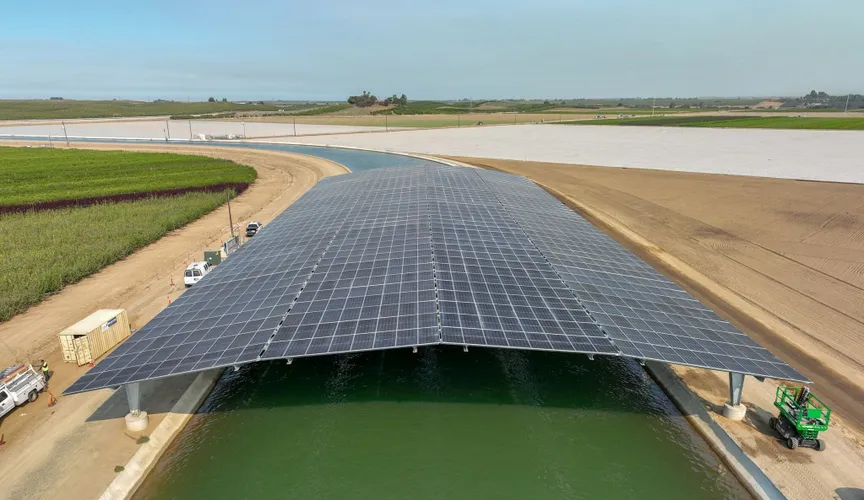
California’s first solar-covered canal comes online
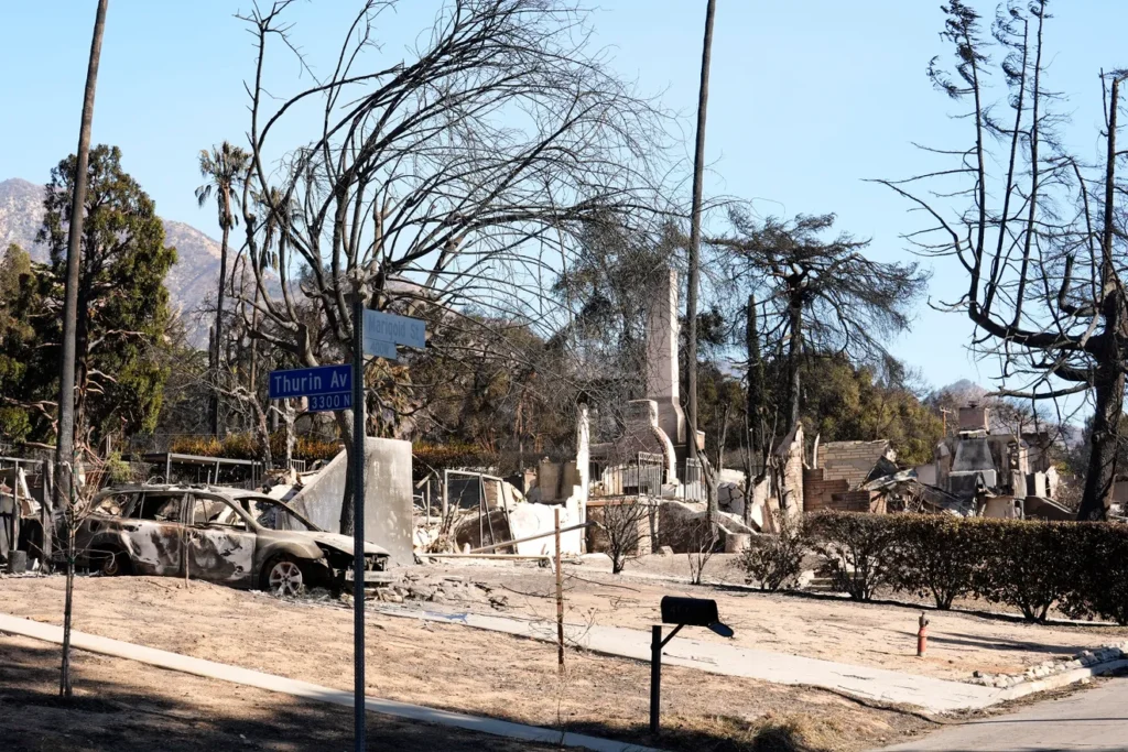
Homeowners trying to rebuild after Altadena’s Eaton Fire face concerns over lead levels in soil
Related Projects
IJLA Infrastructure Scorecard: Landscape View

- USC
Testing L.A.’s oceans and rivers after the 2025 wildfires
Measuring water quality post-wildfires to understand potential health and environmental risks.

- USC
Greening L.A.’s hottest streets
Bringing more trees, shade, and fresh air to L.A. by identifying where, what kind, and how many trees to plant for the biggest impact.